TURNING RED
DESIGN IN MOTION
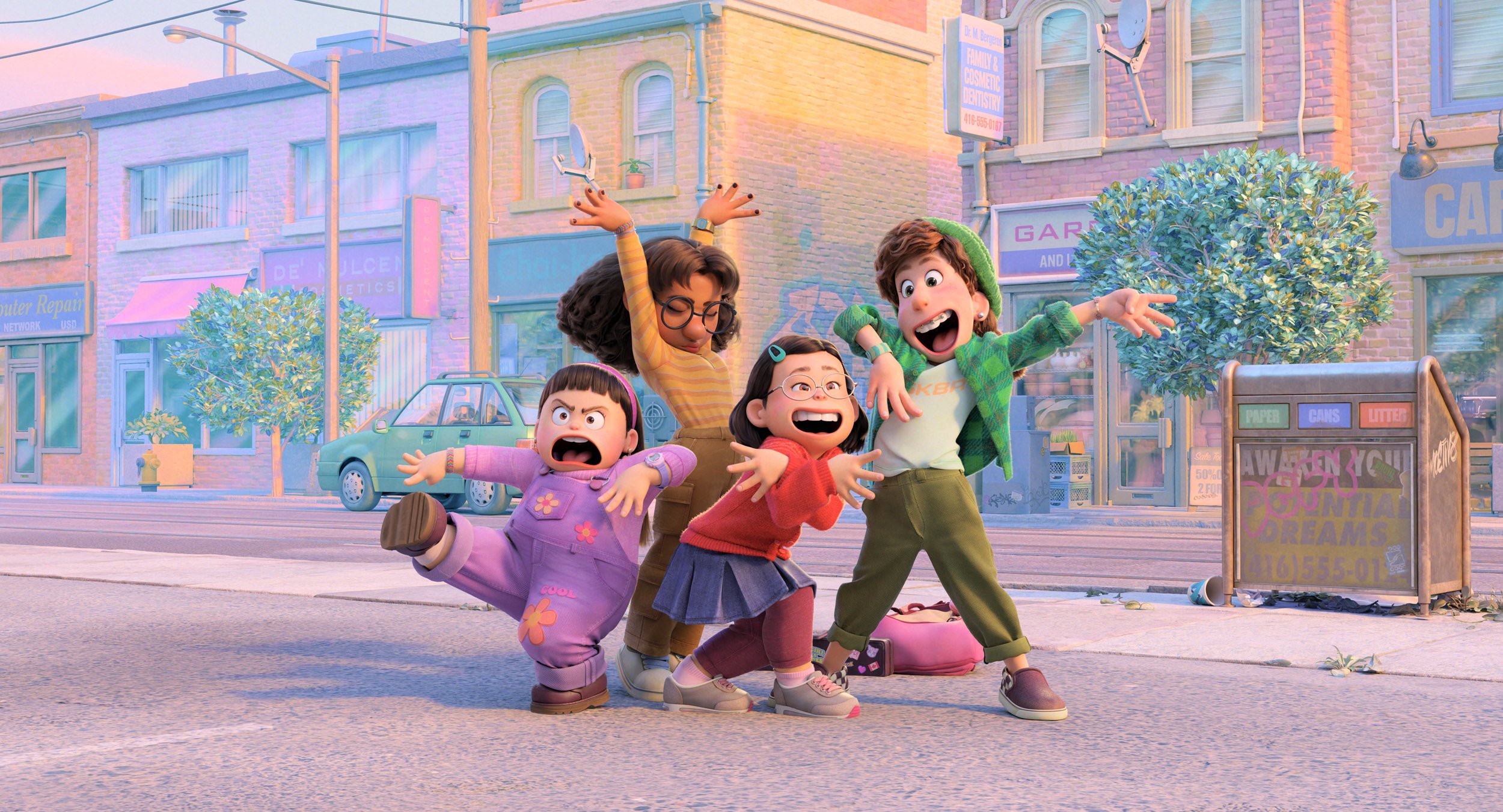
Turning Red follows Meilin Lee as she comes into maturity and navigates life while managing her changing body.
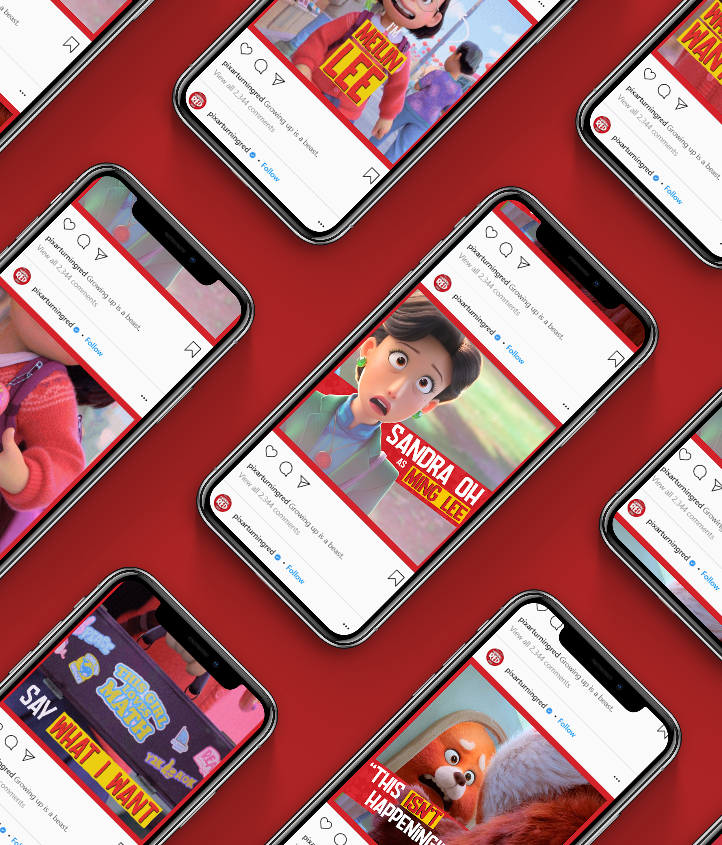
This design direction is inspired by both Chinatown and railway cars present in Ontario and San Francisco. Red is used to emphasize Mei statements of independence.
This project was created as a demo for the design studio who worked with Pixar on their social media series. This demo has no direct connection with Pixar.
SERVICES:
Social Media Design. Communication Design. Motion Graphics.
ASSETS
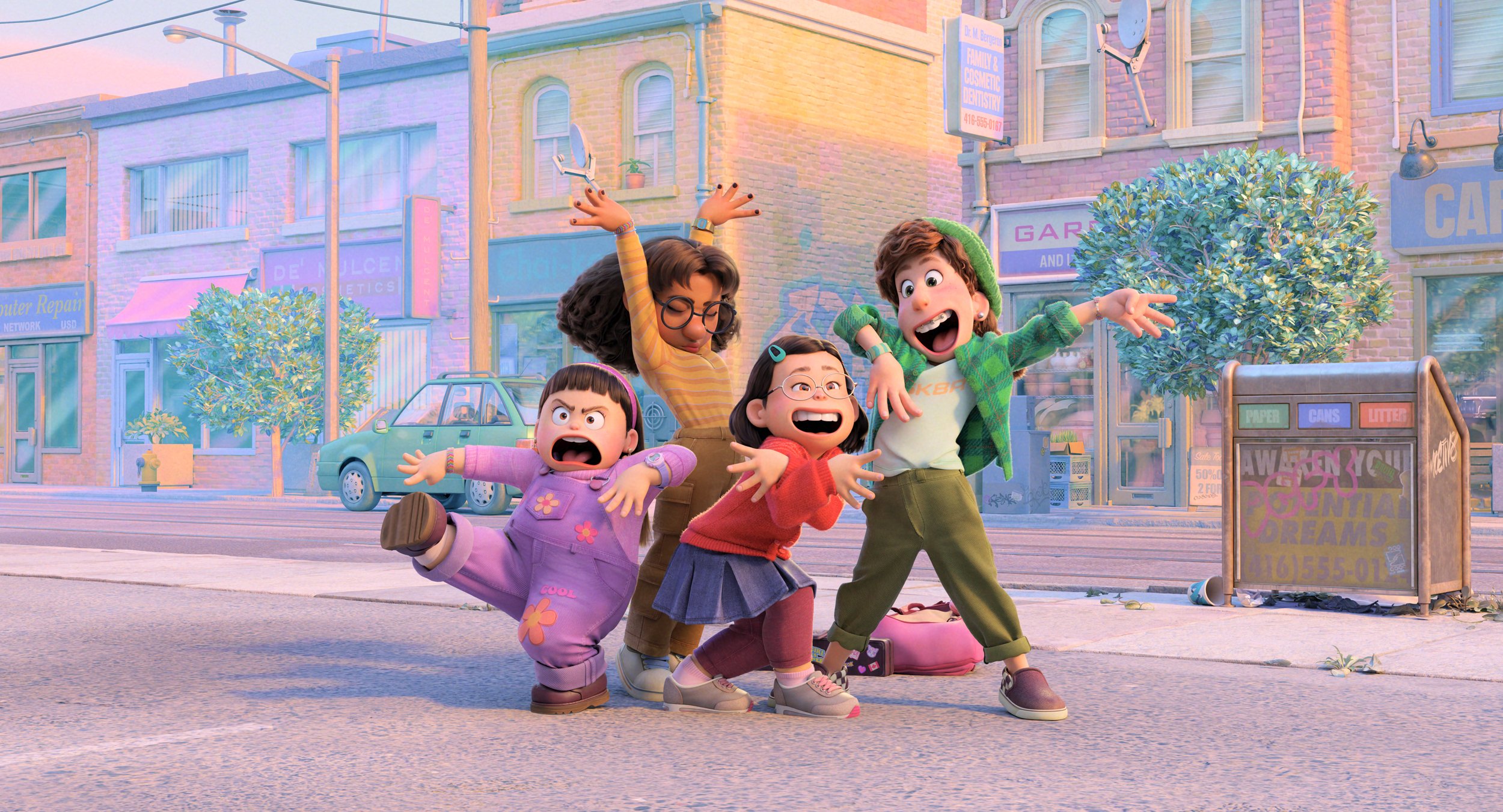
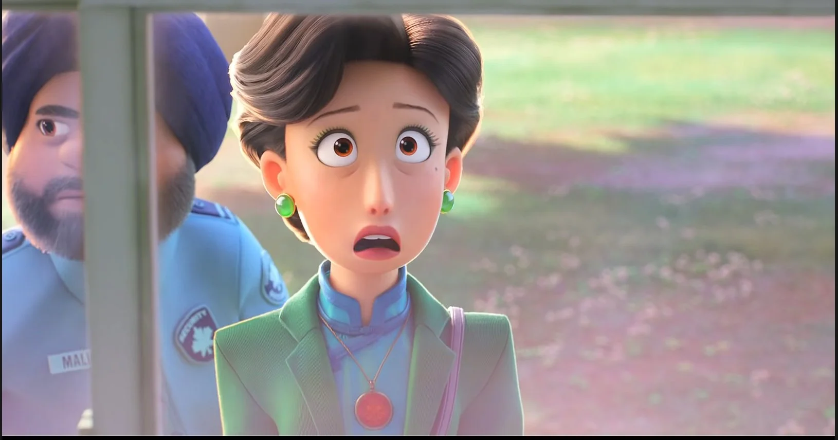
Below are the assets provided to me for the creation of the social media posts. The final design were to be square square in format, it was up to my discretion to crop the images appropriately. The final files were requested to be reduced in quality for fast web viewing.
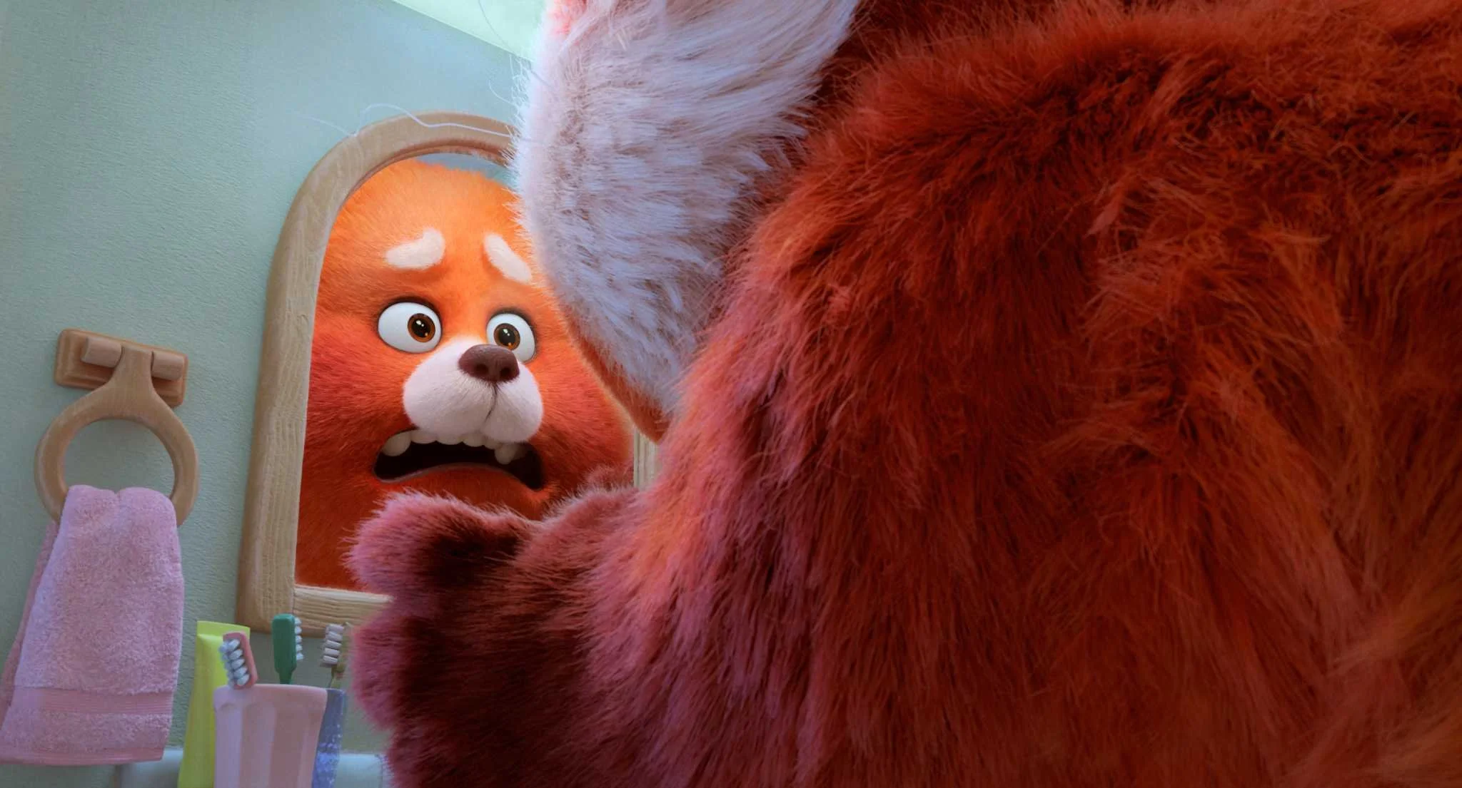
DESIGN DIRECTION
I started the project by gathering inspiration, with a focus on Chinatown in San Francisco to match the aesthetic of the film. I derived the most inspiration from the railcars, as they are an avenue for Meilin to explore the world with her friends. The red border around each post is inspired by the windows on railcars.
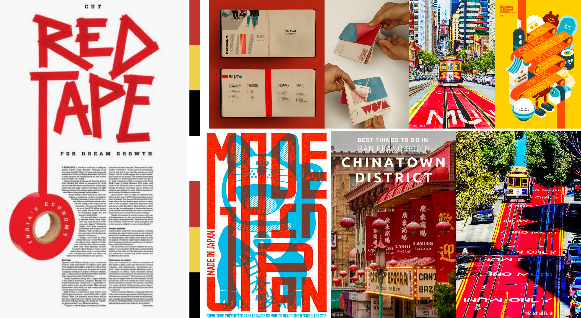
MOODBOARD:
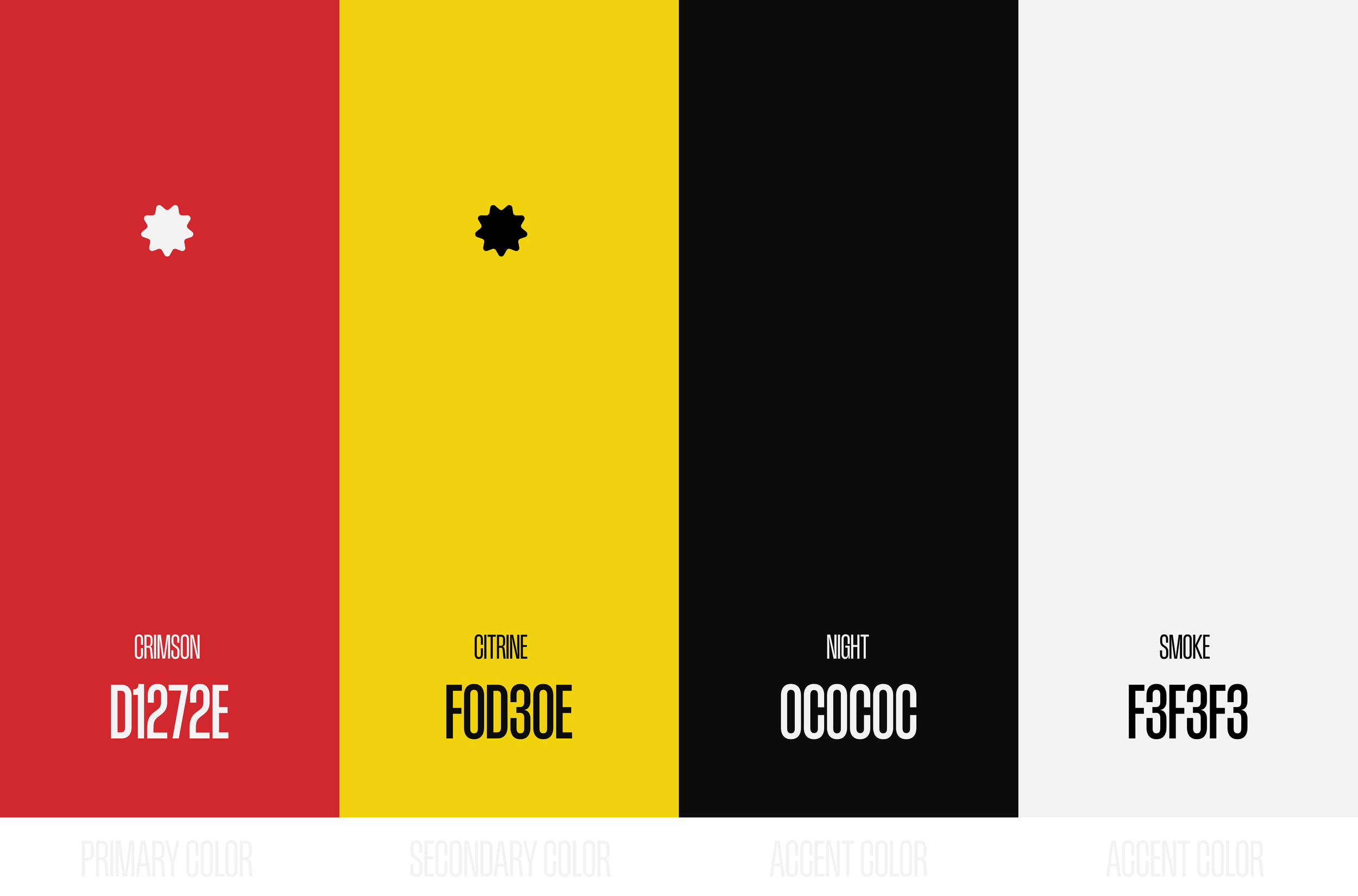
PALETTE
The palette was bright and bold, with heavy influence from the San Francisco trolleys. Additionally, it was inspired by the Bauhaus, specifically the works of László Moholy-Nagy.
TYPEFACES
Headline Copy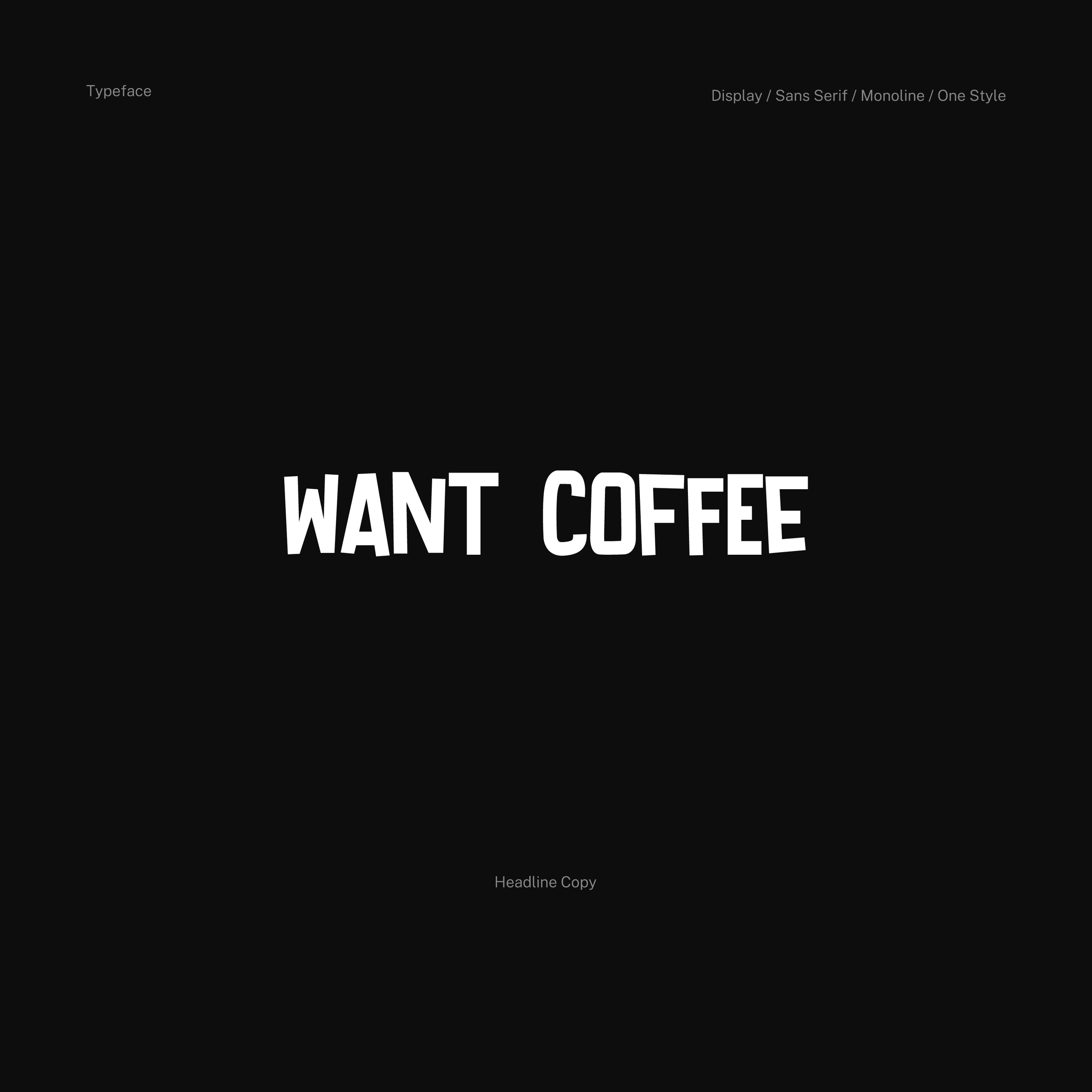
Body Copy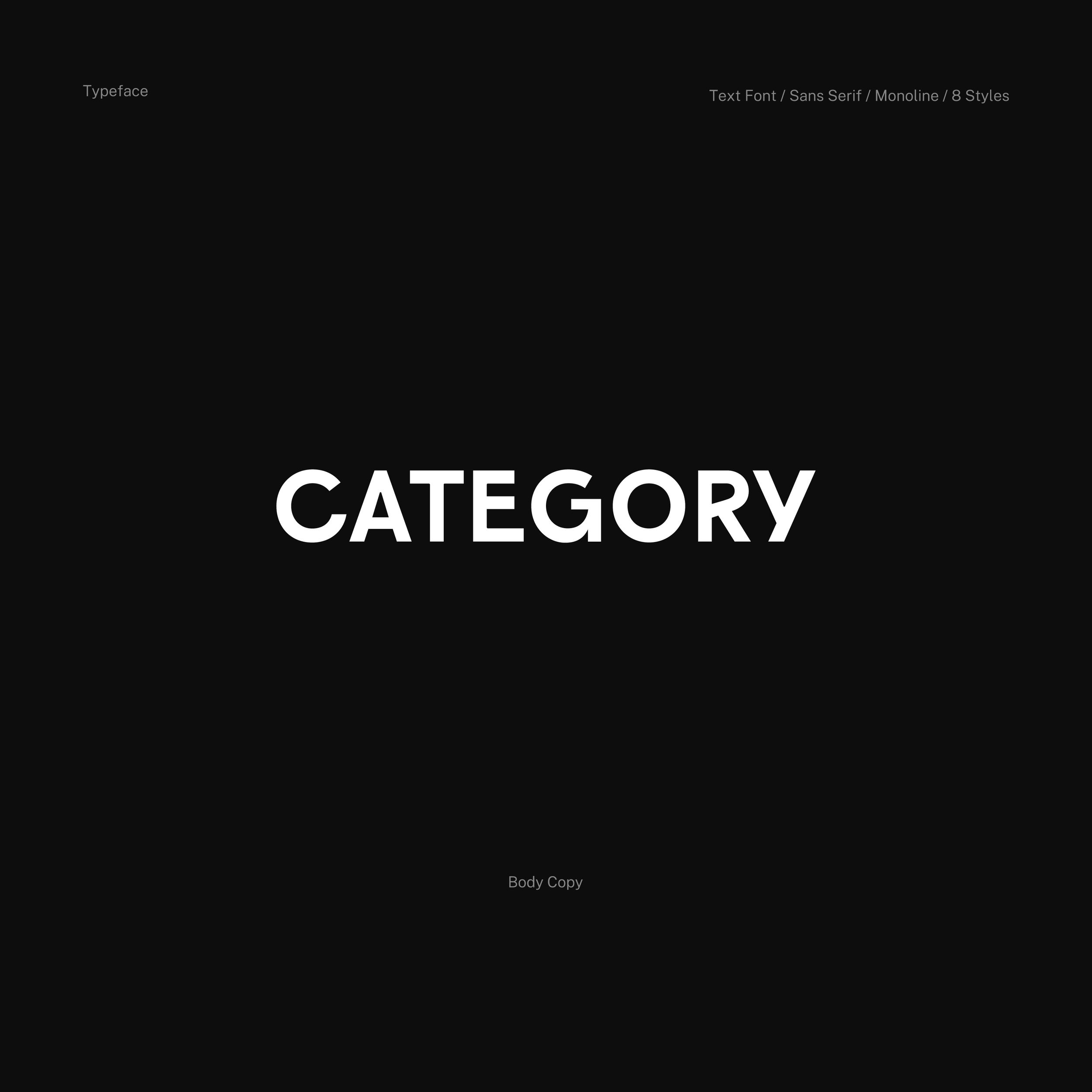
PATTERN AND TEMPLATE
I created the pattern below to fill the red space of the design and to add visual appeal. At this stage, I also created the asset template with the pattern as the fill of the border. The scale and position of the border pattern match the fill of the character/quote cards, which allows them to flow seamlessly.
Geo Pattern
Asset Template
CHARACTER AND QUOTE CARDS
I first designed the character and quote cards. I used the bold yellow from the palette behind the text to give a highlighter effect, and to intensify the red. This, combined with the hand-drawn copy, give the effect of a schoolbook collage.
Character Card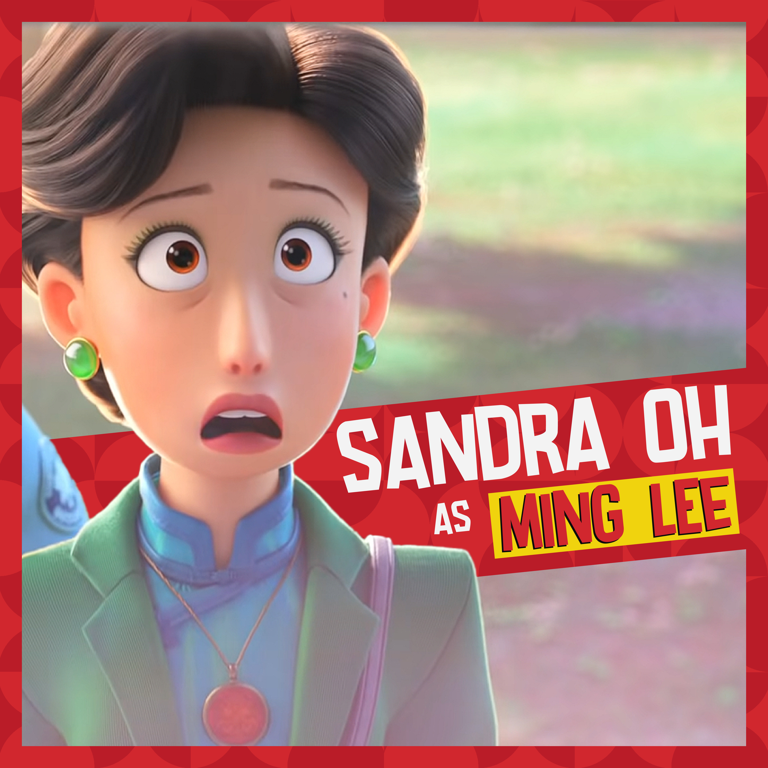
Quote Card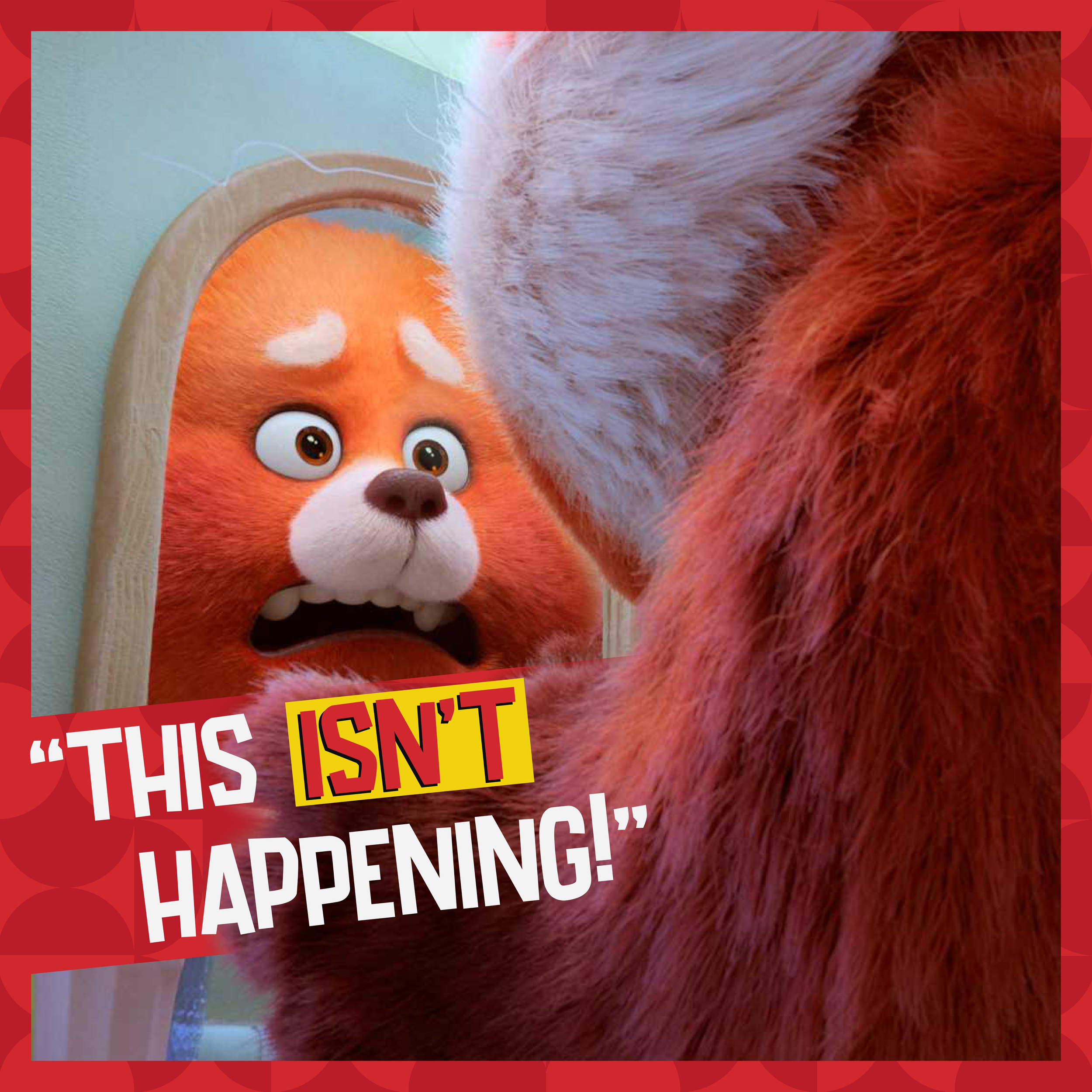
VIDEO QUOTE CARD
The video quote card follows the same design system as the two previous cards. The text in red highlights Meilin’s statements of independence. The white text in the animation ramps up into view, while the red text typewrites in with the highlighter yellow border. The text has a displacement map applied overtop to give it a more organic feel. It is reminiscent of crumpled paper, which felt appropriate for the aesthetic of the film.
Audio is included in this animated quote card.FINAL
I was able to learn a lot from the agency I worked with about motion graphics and their process of creating style pitches, as well as tips to overcome technical hurdles. They inspired me to be continually thoughtful of each design decision, and to think critically to provide the best creative solutions.