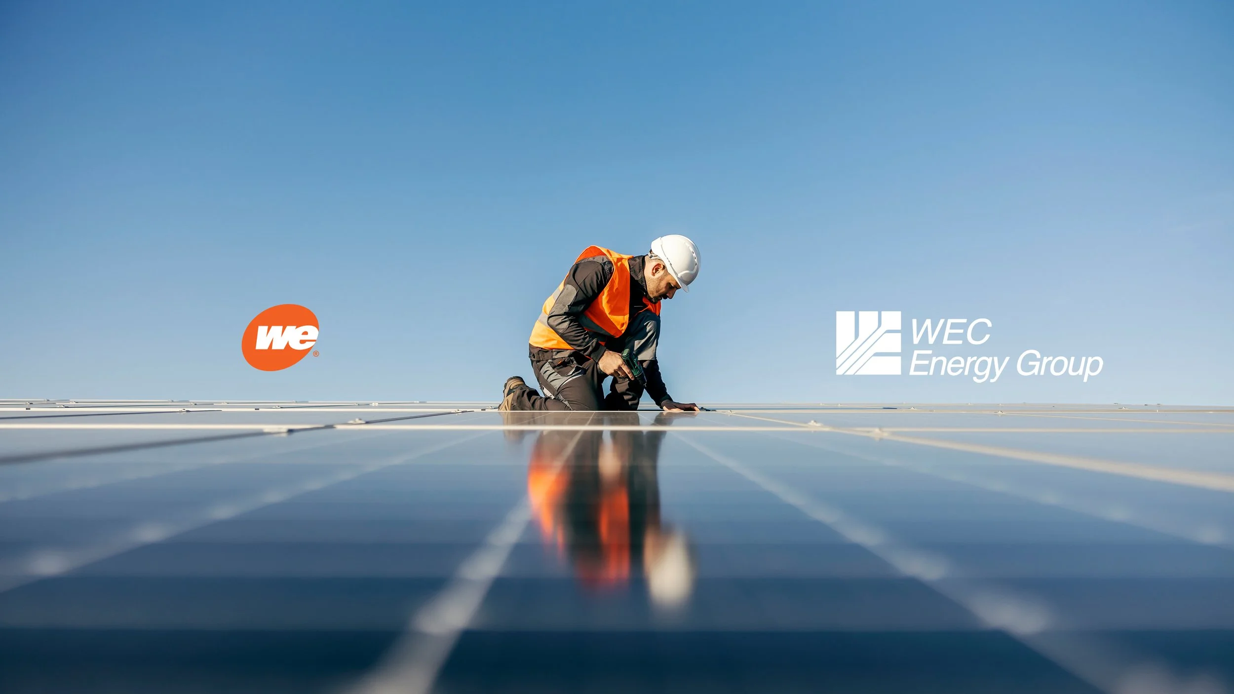
WE ENERGIES — DELIVERING AFFORDABLE, RELIABLE, AND CLEAN ENERGY TO MORE THAN 2.3 MILLION CUSTOMERS IN THE STATE OF WISCONSIN
WEC is one of the nation’s largest electric generation and distribution and natural gas delivery holding companies, with the operational expertise and financial resources to serve the Midwest’s energy needs safely, reliably and responsibly.
Their subsidiaries focus on reliable service, customer satisfaction and shareholder value. Together, they provide energy services to 4.7 million customers in Wisconsin, Illinois, Michigan and Minnesota. Their combined assets allow operating efficiencies across 72,800 miles of electric distribution lines, 48,500 miles of natural gas distribution and transmission lines, and 8,375 megawatts of generating capacity.
Strategy:
The selected typeface Acid Grotesk and additional secondary colors are inspired by the clean aesthetics of the tech industry. This visual language helps reflect We Energies’ agility and innovative status as one of the premier power companies in the Midwest — all while complimenting the existing brand system.
Design:
Note: All information shown is in this project is for demonstration purposes only and may not be accurate.
Both We Energies and their parent company, WEC Energy Group, have been considered in this project. We Energies and WEC Energy Group share Blaze Orange and White. The former gains Wisteria Blue as a primary color, while the latter gain the Baltic Pattern. The Baltic Pattern is comprised of both angled ovals and squares, is a nod to both companies logos. While the focus is on We Energies, synergy has been created across both companies.
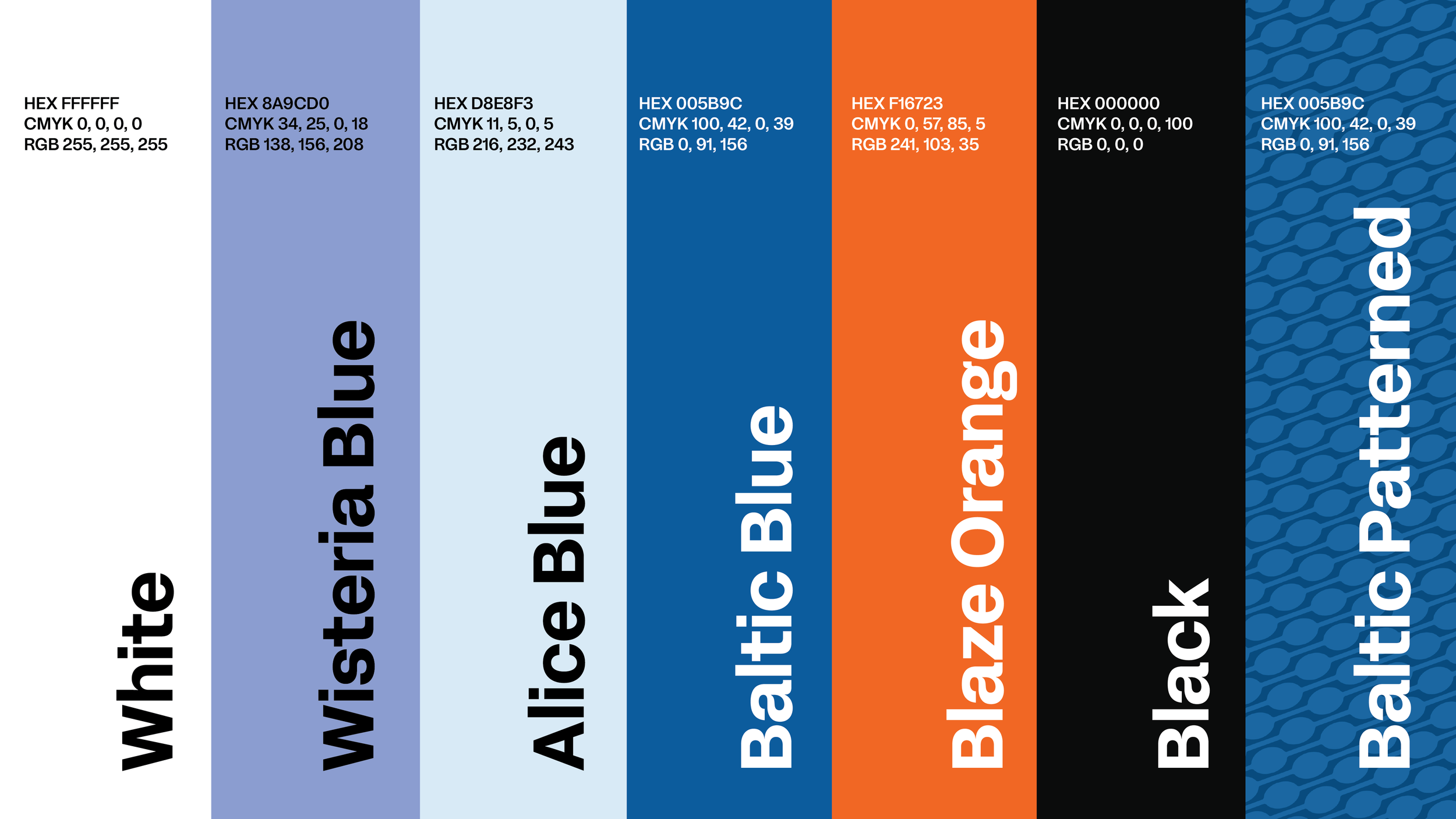
Palette

Typeface
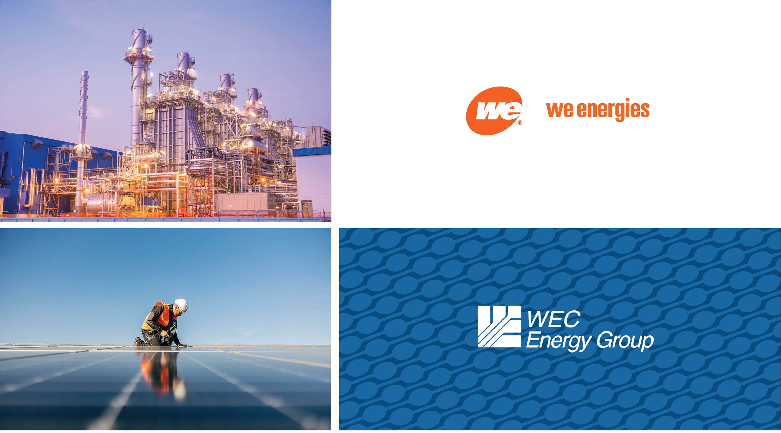
Mood Imagery, Logos, and Pattern
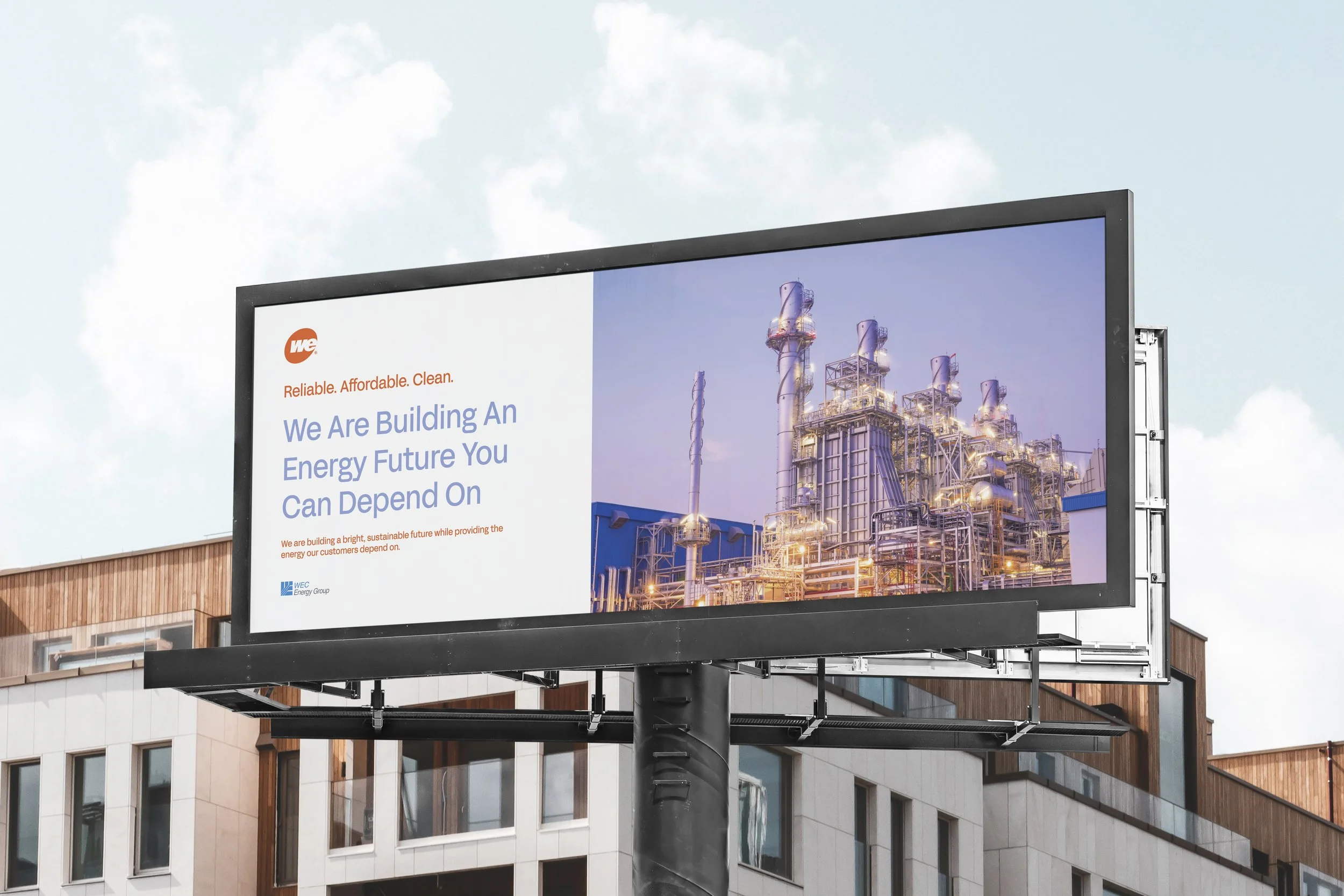
OOH Billboard
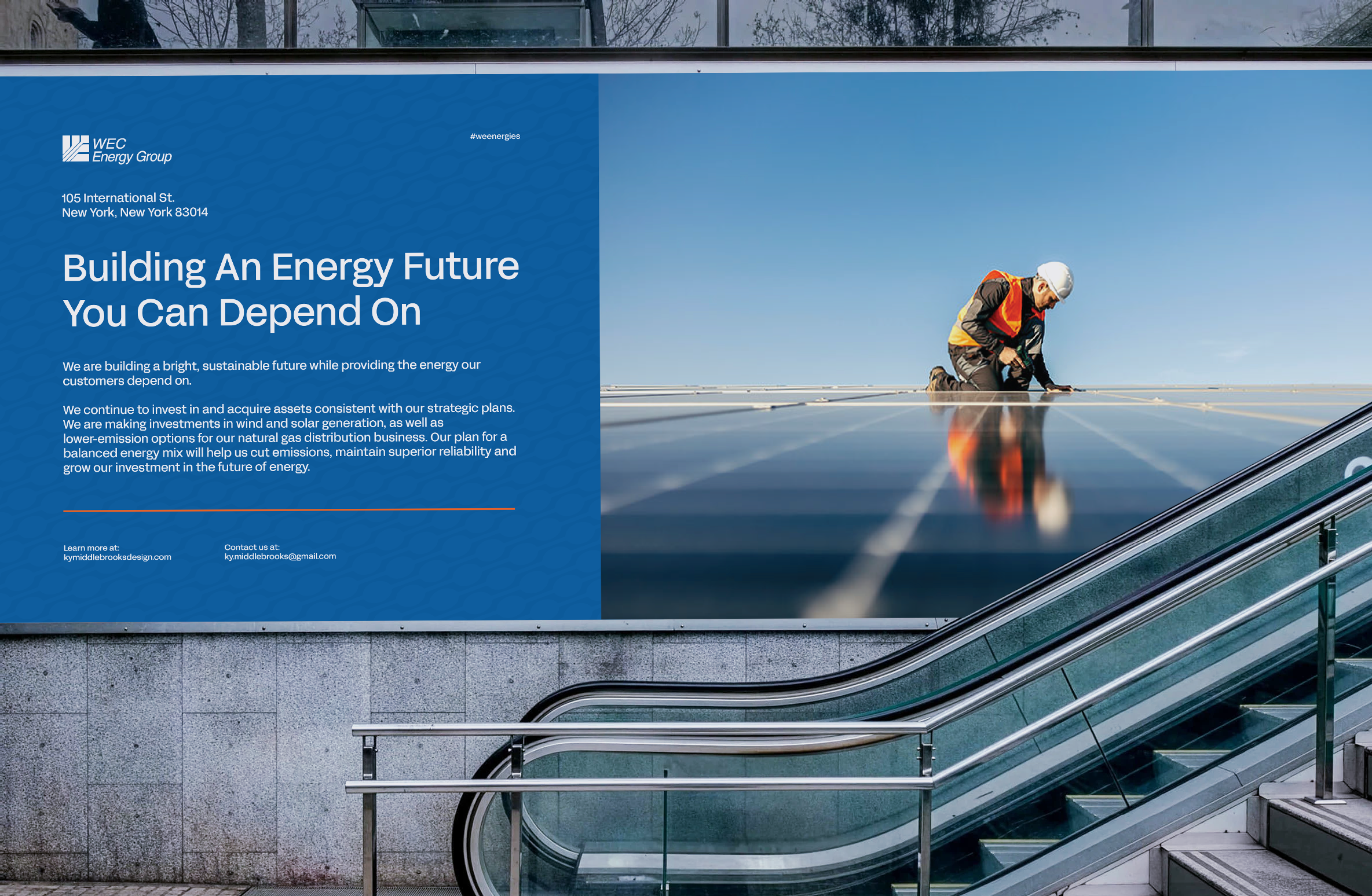
OOH Metro
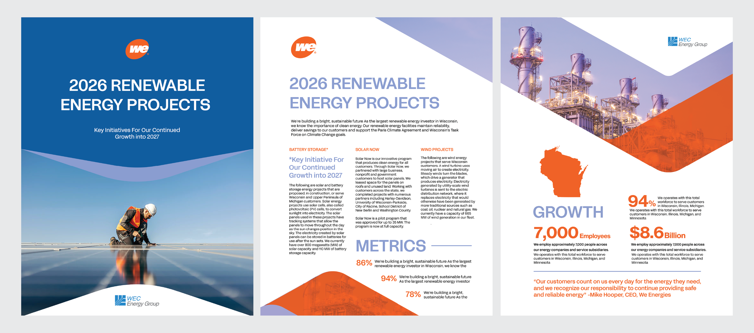
We Energies Brochure
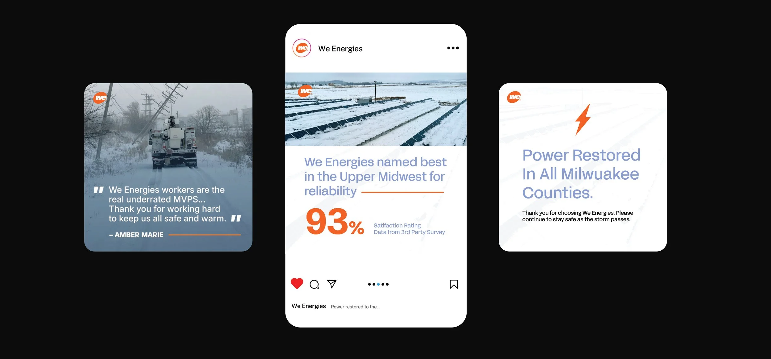
Social Media Series. Post One is a quote card from We Energies I designed against.
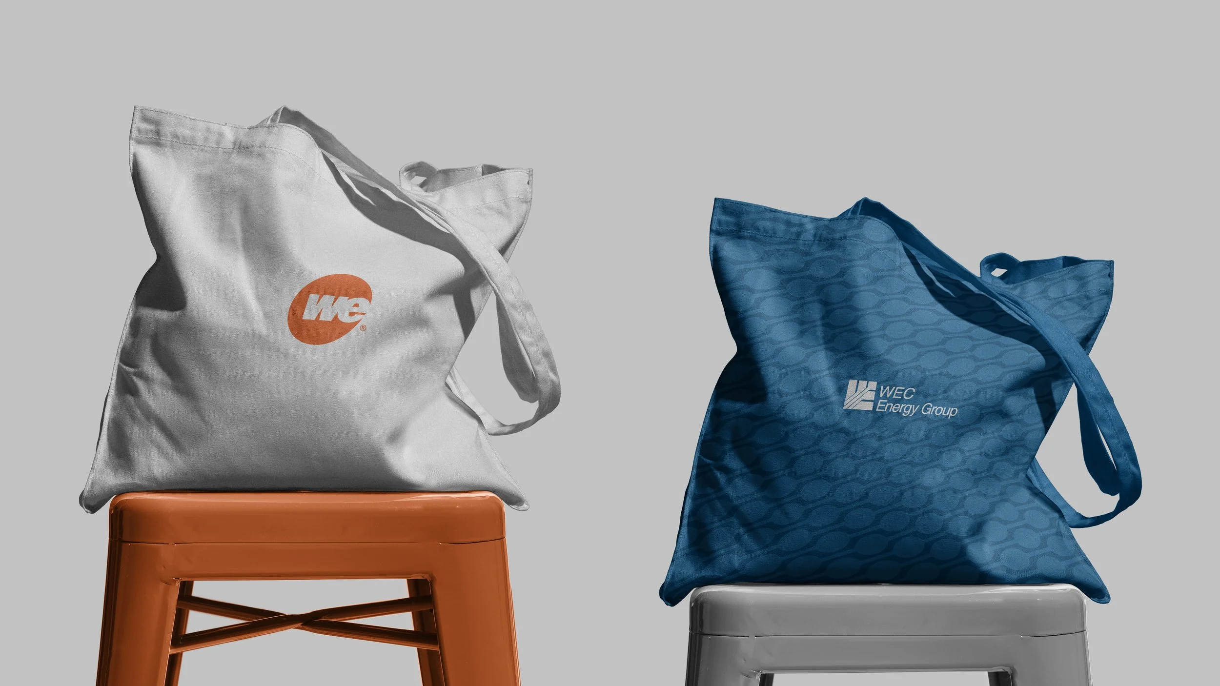
We Energies/WEC Tote
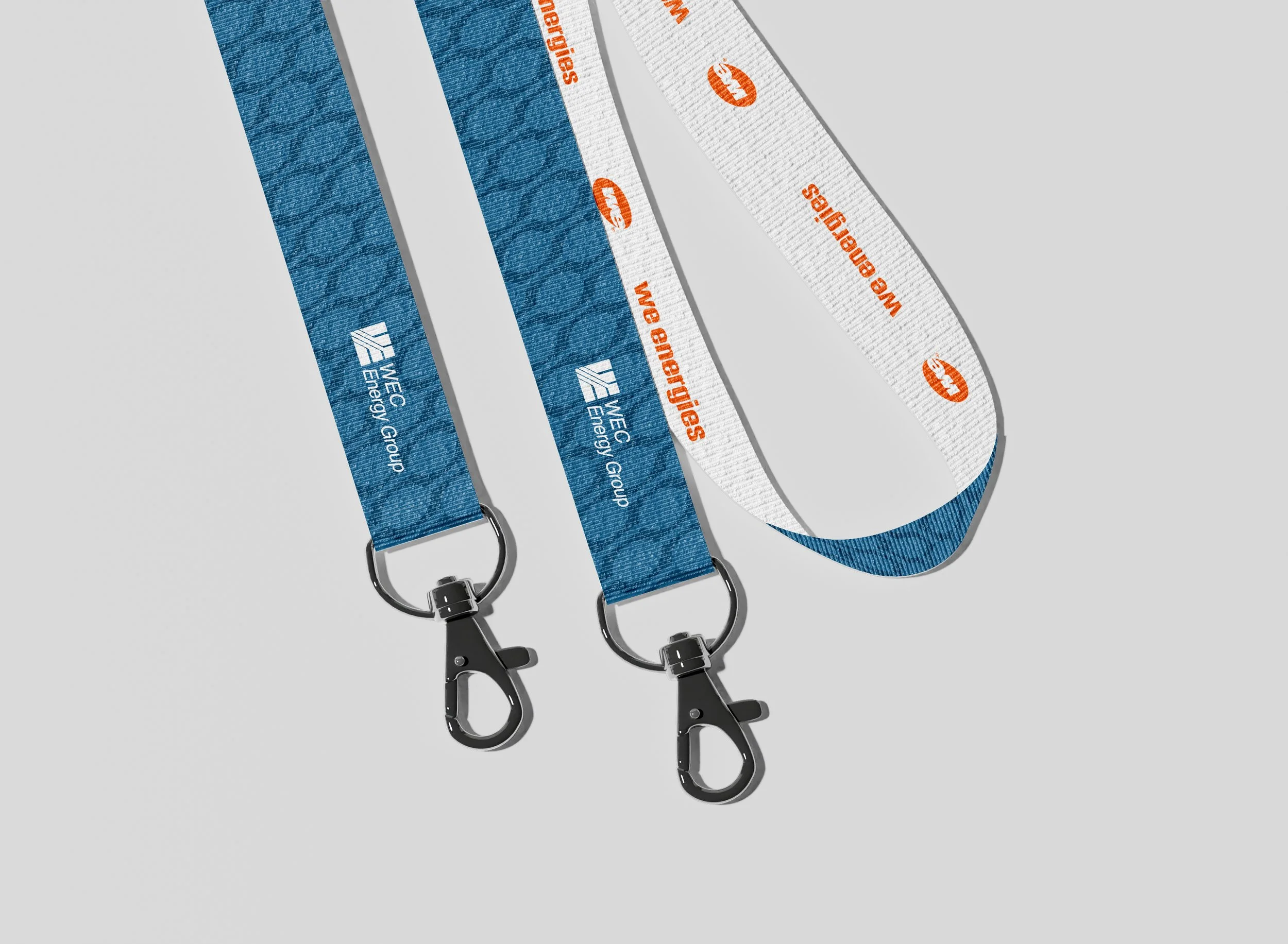
We Energies/WEC Lanyard
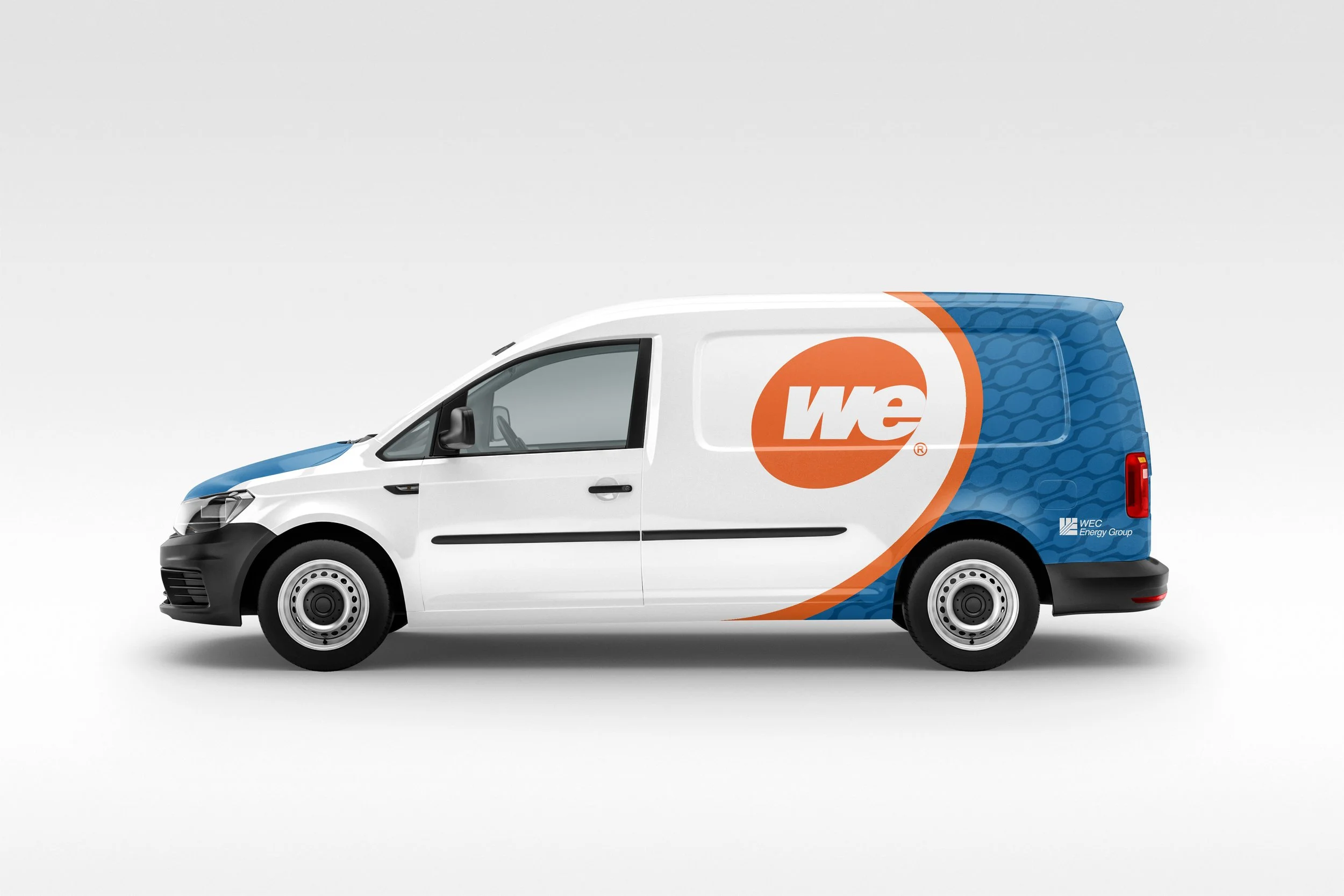
We Energies/WEC Van
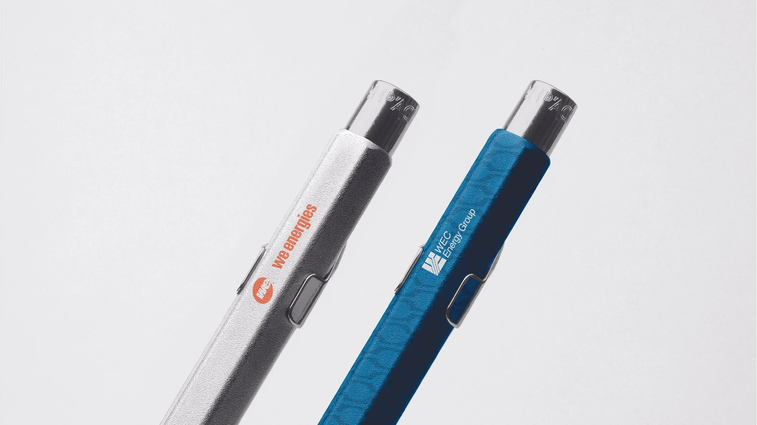
We Energies/WEC Pens
THANK YOU.
PROGRAMS USED:
Adobe Illustrator
Adobe Photoshop
Adobe InDesign
CREDITS:
Designer: Ky Middlebrooks
Year: 2026